
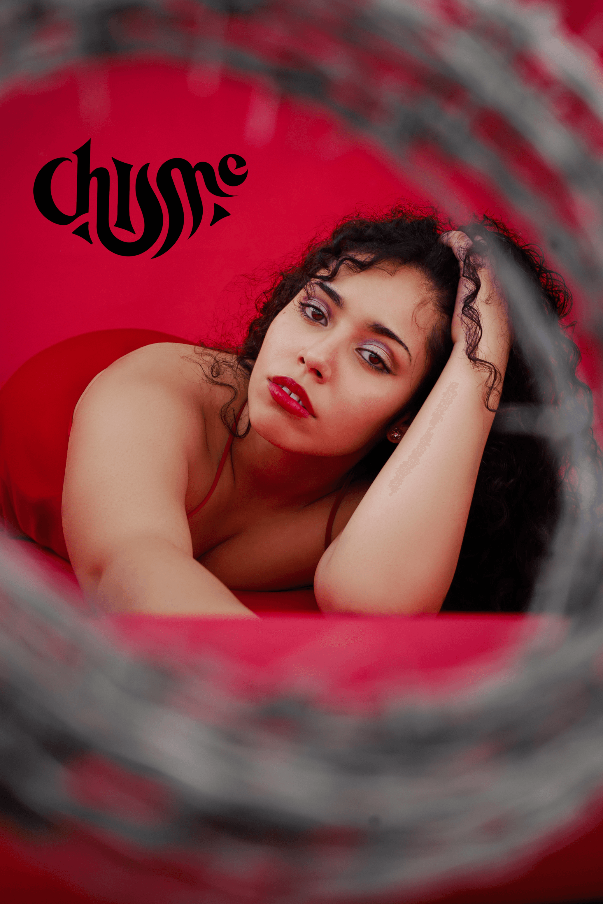

CHISME
Chisme" stands out by transforming stories into a form of artistic expression and a means of building a sense of community. By embracing the allure of the unsaid and the excitement of the unheard, "Chisme" creates a platform where stories becomes a canvas for creativity and a stage for connection.
THE BRAND.
"Chisme" stands out by transforming stories into a form of artistic expression and a means of building a sense of community.
Font
Font
Logo
Logo
Colour
Colour
PROBLEM
Design a brand identity that captures the Chisme vibe, playful, mysterious, and community-driven. The challenge was to create a logo that feels intimate and expressive, without being cliché. It needed to appeal to a young, diverse audience and work across digital and physical spaces, from album art to merch.
PROCESS
I started by exploring indie music visuals and cultural storytelling. The typography was custom-built to resemble lips, a subtle nod to gossip and connection. The flowing script style mirrors the rhythm of music and conversation. Colors were chosen to feel soft but bold, and the logo was tested on everything from microphones to stickers.
SOLUTION
The final identity captures the essence of Chisme — a space where stories and sound collide. The logo is expressive but simple, playful but stylish. It works across formats, tells a story on its own, and invites curiosity. Whether on stage gear or social feeds, it always says: this is something worth listening to.
PROCESS
The final identity captures the essence of Chisme — a space where stories and sound collide. The logo is expressive but simple, playful but stylish. It works across formats, tells a story on its own, and invites curiosity. Whether on stage gear or social feeds, it always says: this is something worth listening to.