YYC Come Up is a hub where people who believe in Calgary’s music potential come together to share, grow, and elevate.
UX
UI
Visual Design
Product Design

Project Overview
Client: YYC Comeup, a music label startup
Industry: SaaS, Fintech
Timeline: 3 weeks (2025)
My Role: Brand Designer
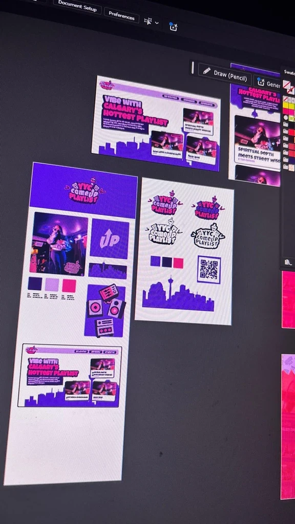
YYC Comeup Playlist needed to stop the scroll and earn a scan in seconds. The artwork lacked immediate pop, and the QR code didn’t stand out. I also needed a quick, unmistakable Calgary vibe across print and socials.
Process
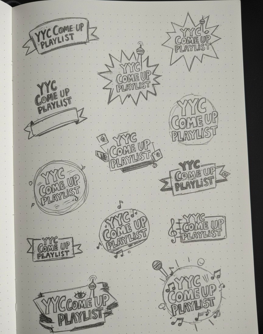
Before jumping into digital tools, I explored ideas on paper to capture different directions for the YYC Come Up Playlist identity. These quick sketches helped me play with layout, typography hierarchy, and symbol ideas, like musical notes, banners, and burst shapes that communicate energy and movement.
Design Solution
I built a scan first system: vivid colors for instant contrast, a boldly framed QR with generous quiet space, and Calgary references woven through custom iconography and textures. Extra graphic elements give flexible layouts for print and social. The result? faster recognition, easier scanning, and a brand that reads YYC at a glance.